
Making interfaces that just feel right, the kind where you don’t have to think too hard about what to do next, is what intuitive UI/UX design is all about. It’s less about flashy animations and more about understanding how people naturally solve problems and interact with the world. When something is intuitive, it seems obvious, almost like it was designed just for you. This isn’t magic; it’s a careful blend of psychology, research, and practical design principles that guide users effortlessly through a digital experience. The goal is to minimize cognitive load, reduce friction, and ultimately make technology feel less like a hurdle and more like a helpful tool.
Before you can build something intuitive, you absolutely have to know who you’re building it for. This isn’t a vague “people.” It’s about deeply understanding the specific individuals who will be using your product. What are their goals? What are their frustrations? What’s their technical proficiency? This knowledge is the bedrock upon which all intuitive design rests. Without it, you’re just guessing, and guessing rarely leads to an experience that feels natural and easy.
Who are They, Really?
Forget demographics for a moment. Think about psychographics. What motivates them? What are their everyday behaviors? Are they trying to accomplish a quick task on the go, or are they settling in for a deep dive? Understanding their mindset is crucial. A busy professional needs something fast and efficient; a hobbyist might appreciate more exploration and discovery.
- Persona Development: This is your systematic way of creating fictional representations of your ideal users. Give them names, backstories, motivations, and pain points. These personas aren’t just for show; they become your compass. When you’re stuck on a design decision, you ask: “What would Sarah do?” or “How would John react?”
- User Journeys: Map out the steps a user takes to achieve a specific goal with your product. This helps identify potential roadblocks, moments of confusion, and opportunities to simplify. It’s like walking in their shoes, but on paper.
What Do They Want to Achieve?
At its core, a user interacts with an interface to get something done. Intuitive design anticipates these needs and makes the path to achieving them as clear as possible. This means focusing on the user’s end goal, not just the features you’ve built.
- Goal-Oriented Design: Every element, every interaction, should directly contribute to helping the user reach their objective. If something doesn’t serve a clear purpose in their journey, it’s likely creating clutter.
- Context is King: Consider where and when users will be interacting with your product. Are they on a small mobile screen with limited attention? Are they in a noisy environment? Understanding the context helps tailor the experience to be effective even in less-than-ideal situations.
For those interested in enhancing their understanding of UI/UX design, a related article that provides valuable insights is available at this link: How to Build an Effective Business Website in Malaysia. This article discusses essential elements of web design that can significantly improve user experience and engagement, making it a great resource for anyone looking to create a successful online presence.
Simplicity is Not Simplistic: The Art of Clarity
Intuitive design thrives on clarity. This doesn’t mean stripping away all functionality, but rather presenting it in a way that is immediately understandable. It’s about removing the unnecessary and making the essential shine. Think of a well-organized toolbox – everything has its place, and you can find what you need without rummaging.
Less is Often More
The temptation to pack every possible feature into an interface is strong. However, this often leads to overwhelming users. Simplicity, in this context, means focusing on the core tasks and making them prominent.
- Minimalism in Design: This goes beyond just aesthetics. It’s about reducing visual noise and cognitive load. Every button, every piece of text, every graphic should have a clear purpose and contribute to the overall understanding.
- Progressive Disclosure: Don’t show users everything at once. Reveal information and options as they are needed. This keeps the initial interface clean and prevents users from feeling overwhelmed by too many choices. Think of an accordion menu or a step-by-step process.
Clear Communication is Key
The language you use and the way you present information directly impacts how intuitive your design feels. Avoid jargon, technical terms, or confusing metaphors.
- Actionable Language: Buttons and links should clearly indicate what will happen when clicked. Instead of “Submit,” try “Save Profile” or “Request Access.”
- Consistent Labelling: Use the same terms for the same actions or items throughout your interface. If you call something a “shopping cart” on one page, don’t suddenly switch to “basket” on another.
- Visual Hierarchy: Guide the user’s eye. Use size, color, contrast, and spacing to emphasize important elements and de-emphasize less critical ones. This helps users quickly scan and understand the layout.
Familiarity Breeds Comfort: Leveraging Existing Mental Models
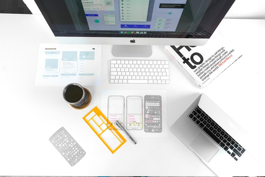
People come to your interface with pre-existing ideas about how things should work, built from years of interacting with technology and the real world. Intuitive design taps into these “mental models” to make the experience feel familiar and predictable.
Don’t Reinvent the Wheel (Unless You Have a Very Good Reason)
Users have learned patterns. For instance, most people understand that clicking on a magnifying glass icon means search, or that a shopping cart icon represents items they want to buy. Deviating from these established patterns without clear justification can be a recipe for confusion.
- Standard UI Patterns: Utilize common interface elements and interaction styles that users are already accustomed to. Think about navigation bars, dropdown menus, and form input fields. These are familiar territories.
- Metaphors and Analogies: Sometimes, relating a digital concept to a real-world object can make it more understandable. A “folder” for documents or a “trash can” for deleted items are classic examples.
Consistency Across the Board
Consistency isn’t just about using the same colors. It’s about predictable behavior, layout, and language. When elements behave consistently, users learn them once and can apply that knowledge throughout the entire experience.
- Internal Consistency: Ensure that within your own product, similar elements function and look the same. A “save” button should always offer the same saving action, regardless of where it appears.
- External Consistency: Where appropriate, align with established conventions of similar products or platforms. This helps users transfer their existing knowledge to your interface.
Providing Feedback: Letting Users Know What’s Happening
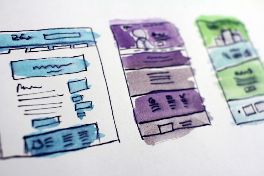
A truly intuitive experience feels like a conversation. The interface responds to the user’s actions, and the user understands what the interface is doing. This constant feedback loop is essential for building trust and preventing frustration.
You’ve Pressed the Button, Now What?
When a user performs an action, they need to know that it’s been registered and what the result is. Silence can be deafening, and often indicates a problem.
- Visual Cues: Buttons should change appearance when clicked or hovered over. Loading indicators should appear when a process is underway. Success messages or error notifications should be clear and timely.
- Auditory Feedback (Use Sparingly): In some cases, a subtle sound can confirm an action, but this should be optional and not overly obtrusive. Think of a gentle click rather than a loud ding.
Guiding Through Processes
For multi-step processes, providing clear progress indicators is vital. Users want to know where they are, how much further they have to go, and what the next step will be.
- Progress Bars and Steppers: These visual aids break down complex tasks into manageable chunks, reducing anxiety and providing a sense of accomplishment as each stage is completed.
- Confirmation Messages: After a significant action, a confirmation message reassures the user that their action was successful and, if applicable, what the next steps are.
In the realm of UI/UX design, understanding the importance of website maintenance is crucial for ensuring a seamless user experience. A well-maintained website not only enhances usability but also keeps the design elements fresh and engaging. For those interested in exploring how regular maintenance can significantly impact user satisfaction, a related article can be found here: website maintenance services. This resource highlights why Malaysian businesses should prioritize ongoing support to maintain their digital presence effectively.
Error Handling: When Things Go Wrong (And They Will)
| Metrics | Data |
|---|---|
| Conversion Rate | 15% |
| User Engagement | 70% |
| Page Load Time | 2.5 seconds |
| Customer Satisfaction | 85% |
No user interface is perfect, and users will inevitably make mistakes or encounter unexpected issues. Intuitive error handling means making these problems as painless and easy to resolve as possible. It’s about supporting the user when they’re stuck, not blaming them.
Be Helpful, Not Accusatory
The language used in error messages can significantly impact the user experience. Avoid using overly technical jargon or making the user feel incompetent.
- Clear Explanations: Tell the user exactly what went wrong in simple terms. “Invalid input” is unhelpful. “Please enter a valid email address (e.g., example@domain.com)” is much better.
- Actionable Solutions: Don’t just point out the problem; suggest how to fix it. If a form field is missing, highlight it and provide a clear instruction on what to enter.
- Preventative Measures: The best error handling is often no error handling at all. Design your interface to prevent errors in the first place where possible.
Supporting the User When They Stray
Sometimes, users might go down a path that’s not quite right. Intuitive design anticipates this and provides ways to correct course gracefully.
- Undo Functionality: When an action can be reversed, providing an “undo” option is a powerful safety net that encourages exploration.
- Easy Navigation Back: Ensure users can easily backtrack through a process or return to a previous state without losing their progress or feeling trapped.
- Helpful Links: If an error is related to a lack of information or understanding, provide links to relevant help documentation or FAQs.
Testing and Iteration: The Unending Quest for Improvement
Crafting an intuitive UI/UX is not a one-and-done task. It’s an ongoing process of understanding, designing, testing, and refining. The insights gained from real users are invaluable and often reveal areas where your design assumptions fall short.
Putting Your Design to the Test
Theoretical perfection is rarely achieved without real-world validation. Watching how actual users interact with your interface is the most effective way to identify what works and what doesn’t.
- Usability Testing: Observe users as they attempt to complete tasks using your design. Pay close attention to where they hesitate, get confused, or express frustration.
- A/B Testing: Present different versions of a design or feature to different user groups to see which performs better against specific metrics. This is a data-driven approach to optimization.
- Heuristic Evaluation: Have experienced UX professionals review your design against established usability principles (heuristics) to identify potential problems.
Embracing Change Based on Feedback
The results from your testing should directly inform your design decisions. Be prepared to make changes, even if it means rethinking a beloved feature.
- Iterative Design: Treat your design as a living entity. Make small, informed changes, test them, and repeat the cycle. This steady refinement leads to a more robust and intuitive final product.
- Gathering Feedback Continuously: Implement easy ways for users to provide feedback within your application, such as simple rating systems or suggestion boxes. This ongoing stream of input is crucial for long-term success.
By focusing on these principles – understanding your users deeply, prioritizing clarity and simplicity, leveraging familiarity, providing clear feedback, handling errors gracefully, and committing to continuous testing and iteration – you can move beyond just functional interfaces to create digital experiences that feel genuinely intuitive, making technology a more accessible and enjoyable part of people’s lives.