
Creating websites that look good and work well on every device, from a tiny phone to a massive desktop monitor, might sound like a technical headache. But really, it’s all about making things easy for the people using your site. That’s the core of responsive design: making sure your website feels natural and functional, no matter how they’re accessing it. It’s not just about shrinking or stretching; it’s about intelligently adapting content and layout to fit the screen size and the user’s context.
At its heart, responsive web design is a technique where the website’s layout and content adapt themselves to fit the screen size and orientation of the device being used to view it. Think of it like a chameleon – it changes its appearance to blend in with its surroundings. Instead of building separate websites for desktops, tablets, and phones, you build one website that intelligently adjusts. This means a user on a smartphone gets a layout optimized for their thumb, while someone on a laptop gets a more expansive view.
The “Why” Behind Responsive Design
The importance of responsive design boils down to user behavior. More people than ever are browsing the web on mobile devices. If your site isn’t responsive, those mobile users are going to have a frustrating experience. They’ll have to pinch and zoom, scroll endlessly horizontally, and generally struggle to find what they need. This leads to high bounce rates, lost customers, and a damaged brand reputation. Beyond just avoiding frustration, responsive design ensures accessibility for a wider audience with varying needs and devices.
The Technical Foundation: Fluid Grids, Flexible Images, and Media Queries
These three elements are the pillars of responsive design.
- Fluid Grids: Instead of fixed pixel widths, responsive designs use relative units like percentages for layout. This means your columns and sections resize gracefully as the viewport (the visible area of the browser window) changes.
- Flexible Images: Images are often the biggest culprits for breaking layouts. Flexible images use CSS to ensure they scale down proportionally within their containing elements, preventing them from overflowing or becoming distorted.
- Media Queries: This is the magic sauce. Media queries are a CSS feature that allows you to apply different styles based on the characteristics of the device, such as screen width, height, resolution, and orientation. For instance, you can tell your website to stack columns on small screens but display them side-by-side on larger ones.
Responsive design is essential for creating websites that provide an optimal viewing experience across a wide range of devices. For those interested in exploring more about this topic, you can check out a related article that discusses the importance of responsive design in modern web development. This article highlights various strategies and best practices to ensure your website is accessible and user-friendly on any device. To read more, visit this link.
Designing for the Mobile-First Mindset
The mobile-first approach isn’t just a trend; it’s a smart way to build websites that are inherently more efficient and user-friendly. It means you start by designing for the smallest screens (mobile) and then progressively enhance the experience for larger screens.
Why Start Small?
When you design for mobile first, you’re forced to prioritize content and functionality. What’s absolutely essential for a mobile user? What can be simplified or hidden on a smaller screen? This forced prioritization leads to a leaner, more focused design that often benefits all users, not just mobile ones. You can’t afford to cram every single element onto a tiny screen; you have to make tough choices about what truly matters.
Progressive Enhancement: Building Upwards
Once you have your mobile design in place, you can use media queries to add more complex layouts, richer visuals, and additional features for tablets and desktops. This is known as “progressive enhancement.” The core experience is there for everyone, and then users with more powerful devices get an enhanced, more feature-rich version. It’s like building a solid foundation and then adding extra rooms and decorations as you can afford them.
Content Prioritization is Key
In a mobile-first world, content reigns supreme. What information does the user need right now? Think about their context when they’re on their phone – they might be on the go, looking for a quick answer, or trying to complete a specific task. Designing without this in mind will lead to a cluttered mess on mobile. This means cutting out unnecessary jargon, streamlining navigation, and making calls to action prominent and easy to tap.
Implementing Responsive Layouts with CSS
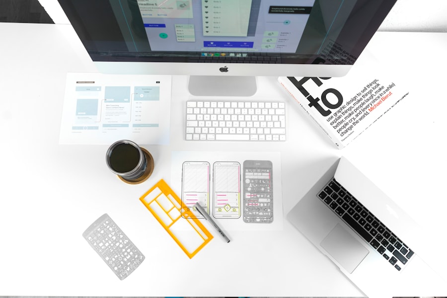
CSS is your best friend when it comes to making your website responsive. It’s where the magic of adaptation happens.
Understanding Viewport Units
While percentages are great, viewport units (vw, vh, vmin, vmax) offer another layer of control.
- vw (viewport width): 1vw is equal to 1% of the viewport’s width.
- vh (viewport height): 1vh is equal to 1% of the viewport’s height.
- vmin (viewport minimum): 1vmin is equal to 1% of the smaller viewport dimension (either width or height).
- vmax (viewport maximum): 1vmax is equal to 1% of the larger viewport dimension (either width or height).
These units are particularly useful for sizing elements like typography, padding, and margins so they scale directly with the screen size.
The Power of Flexbox and CSS Grid
These modern CSS layout modules are game-changers for responsive design.
- Flexbox: Perfect for arranging items in a single row or column. It makes it incredibly easy to align items, distribute space, and control the order of elements, which is crucial for responsive layouts. You can easily switch from a horizontal row of navigation links on desktop to a vertical stack on mobile with a few lines of Flexbox.
- CSS Grid: Designed for creating two-dimensional layouts (rows and columns). It provides a powerful and intuitive way to build complex grid systems that can be easily rearranged for different screen sizes. Imagine designing a product listing page – Grid makes it simple to have a 3-column layout on desktop and a single column on mobile, all managed within the same CSS.
Breakpoints: Where the Design Changes
Breakpoints are the specific widths at which your media queries kick in and your layout changes. There’s no single “right” set of breakpoints; they should be determined by your content and design, not by arbitrary device sizes.
- Content-Driven Breakpoints: Observe your design as you resize the browser window. When does the layout start to look awkward or become difficult to read? That’s where you should consider adding a breakpoint.
- Common Breakpoint Ranges (as a guide, not a rule):
- Small Screens (Phones): Typically below 600px.
- Medium Screens (Tablets): Around 600px to 992px.
- Large Screens (Desktops): 992px and above.
It’s important to remember these are just starting points. You might find you need more, or fewer, breakpoints depending on your site’s complexity.
Responsive Images and Media
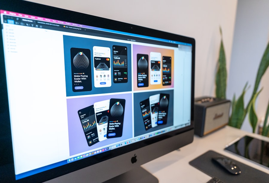
Images and videos can significantly impact loading times and user experience, especially on mobile. Making them responsive is essential.
The srcset and sizes Attributes
These HTML attributes for the
srcset: Allows you to provide a list of image files and their corresponding widths (or pixel densities). The browser then chooses the most appropriate image for the user’s screen size and resolution. This means a user on a small phone doesn’t have to download a massive high-resolution image meant for a 4K monitor.sizes: Tells the browser how wide the image is going to be displayed at different viewport sizes. This information helps the browser pick the best image from thesrcsetlist. It’s like giving the browser a hint about how much space the image will occupy.
The
Sometimes, you don’t just want a different size of an image; you want a completely different image for different screen sizes.
- Art Direction: This is where the
Embedding Responsive Videos
Just like images, videos need to be responsive.
- Aspect Ratio Trick: A common technique involves using CSS to give a container element a specific aspect ratio (e.g., 16:9) and then making the embedded video (